Publisher
bloodyaugust
Godot UI Component Library
A library of fully themable custom components for Godot game engine. Currently adds the following nodes: - SingleSelect - SingleSelectSearch See the repo for documentation.
This plugin has been mirrored from the Godot Asset Library.
The plugin author is in no way affiliated with Gadget.
If you are the author of this plugin and would like this mirror removed, please contact support@gadgetgodot.com.
godot-ui-component-library
A library of custom components for Godot game engine.
Installing the plugin
Add the plugin as normal, and enable in project settings.
Installing python deps and activating pre-commit hooks for gdformat (developing the plugin)
pip install -r requirements.txt
pre-commit install
Components

All components are built internally using base Godot Control nodes. This means components can be styled using their theme property. Any cases where a component uses a CanvasLayer internally (to pull it out of the parent layout, for things like overlapping UI elements), this is worked around by passing the theme to the root child(ren) of that CanvasLayer when theme changes.
Components are added to the "Create New Node" modal, so can be added right to your scene tree like other Control nodes.
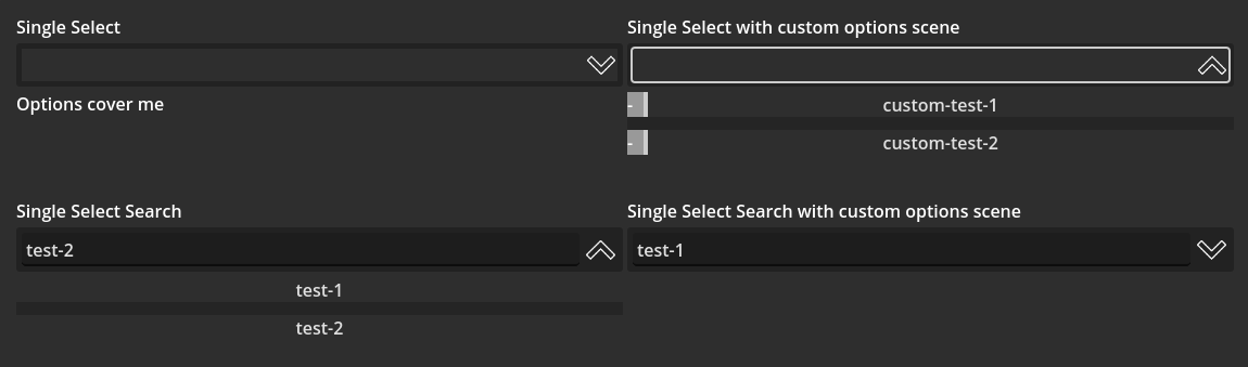
Single Select
Allows you to provide a list of options, and have the user select them from a collapsible dropdown list.


Extends PanelContainer.
Variable Interface
options: Array[String] of selectable options. Shown when the input is expanded.
option_scene: Path || null is loaded when set, if not null. Allows for customizing how options are rendered. When set, option_scene should be the path to a PackedScene, and that scene should implement a text: String property as well as a pressed signal.
option_scroll_height: float height of scroll container for options, defaults to 100px.
expand_icon: Texture2D shown when the input is collapsed.
collapse_icon: Texture2D shown when the input is expanded.
button_custom_minimum_size: Vector2 applied as a custom_minimum_size for the root button component. Especially useful for controlling the minimum height.
selected_option: String is the option selected by the user, or set in code. Displayed as the text of the root button component.
Signals
option_selected(option: String): emitted when the user selects an option. Is not emitted when selected_option is set in code.
Internal Tree
PanelContainerMarginContainerVBoxContainerHBoxContainerButton- the button the user clicks to expand the dropdown, also shows theselected_option
PanelContainerCanvasLayer- used so the dropdown is shown over other layout elements, instead of expanding the size of the root parentScrollContainer- set to auto on vertical scroll, horizontal scroll off, defaults to 100px heightVBoxContainerButton || option_scene- one for eachoptionHSeparator- one between eachoption
Single Select Search
Like a single select, but allows the user to do case-insensitive search to filter options.

Extends PanelContainer.
Variable Interface
options: Array[String] of selectable options. Shown when the input is expanded.
option_scene: Path || null is loaded when set, if not null. Allows for customizing how options are rendered. When set, option_scene should be the path to a PackedScene, and that scene should implement a text: String property as well as a pressed signal.
expand_icon: Texture2D shown when the input is collapsed.
collapse_icon: Texture2D shown when the input is expanded.
search_custom_minimum_size: Vector2 applied as a custom_minimum_size for the root LineEdit component. Especially useful for controlling the minimum height.
selected_option: String is the option selected by the user, or set in code. Displayed as the text of the root LineEdit component.
Signals
option_selected(option: String): emitted when the user selects an option. Is not emitted when selected_option is set in code.
Internal Tree
PanelContainerMarginContainerVBoxContainerHBoxContainerLineEdit- theLineEditthe user focuses to expand the dropdown and filter options, also shows theselected_optiononce one is selectedTextureRect- used to display the expand/collapse icon
PanelContainerCanvasLayer- used so the dropdown is shown over other layout elements, instead of expanding the size of the root parentVBoxContainerButton || option_scene- one for eachoptionHSeparator- one between eachoption