Color Picker Text Button
Plugin for a custom node similar to the ColorPickerButton node but with a text label.
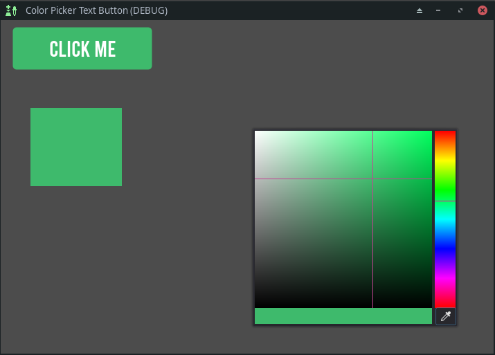
Features of the button
- it uses a style box that is modulated with the picked color
- the color of the text is flipped between a light and dark color to give good contrast with the background color
- the color picker is simplified by default, removing the sliders
- a tool script automatically copies the style and darkens the shade for the button states
Usage
Activate the plugin in Project Settings.
After adding a ColorPickerTextButton node to your scene, you may customize the Script Variables in the Inspector panel.
The label text is changed via the Text Value variable, and the Button text value is deleted/ignored.
To confirm a color selection, click outside the color picker panel.
To reset the Button Style, uncheck the boxes in Button Custom Styles and click the reset button for the Style Script Variable.
Drop a new StyleBox Resource into the Style Script Variable entry box to change the Button Styles.
The fresh property is used as a flag to indicate to the script that the button is new and may be initialized with a size and style.
Signals
- popup_hide - emitted when the popup panel is closed
- color_changed(color) - emitted as the selected color is changed
Other signals are as per the Button Node.